Interactive, Museum, Underwater, Victorian
What's In The Box?
An interactive museum exhibit, imagined
- Category
- Interactive exhibit concept · UX/UI, illustration & 3D
- Programme
- MSc Design for Interactive Media, University of Edinburgh
- Role
- Solo, concept, narrative, illustration, 3D modelling, UI
A speculative interactive kiosk for a natural history-style museum. Visitors uncover a barnacle-crusted box recovered from the North Sea, believed to have belonged to a Victorian woman, and unlock its secret compartment of vintage makeup, piece by piece.
UX/UI design, illustration & 3D, case study recap
What's In The Box?
- Solo Project
- University of Edinburgh
- Museum interaction concept
Role
Concept & Interaction Designer Narrative → storyboard → IA → UI → 3D asset design
Tools
Procreate, Blender Illustration, 3D modelling & rendering, UI layout
Format
Museum touchscreen kiosk Designed for an in-gallery interactive exhibit
The brief
Turn a museum object into an interaction
The brief for Design for Interactive Media was open: design the interface for an interactive museum exhibit. Rather than illustrating an existing artefact, I invented one, a box, its backstory, and the objects hidden inside it, so the interaction itself could carry the discovery.
Proposed concept
In the story, a group of deep-sea explorers recover a locked wooden box from the North Sea. Museum visitors play the role of that discovery: they read the find's backstory, then unlock and explore the box's compartments to reveal what's believed to be a Victorian woman's hidden collection of makeup.
- Narrative-led UX
- Interaction design
- Illustration
- 3D modelling
Research
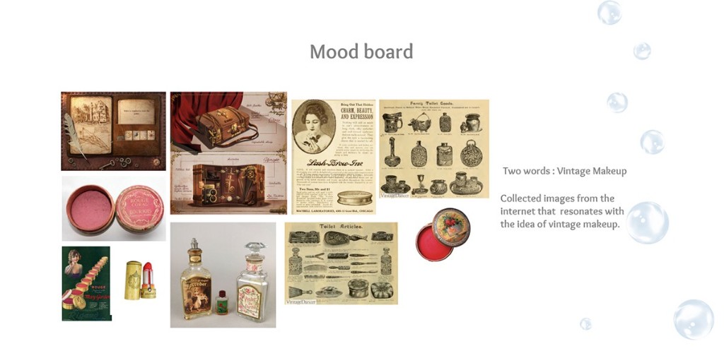
Started from a two-word brief I set myself, “vintage makeup”, and built a mood board of period tins, lipsticks and perfume bottles to ground the object world.
Design
Sketched and 3D-modelled the box and every artefact inside it, then built the screen flow around a single interaction: open, explore, read.
Delivery
Full UI for a touchscreen exhibit, home, story, explore and gallery, styled to feel hand-found rather than manufactured.
Research & inspiration
Vintage makeup, and a box that locks like a memory
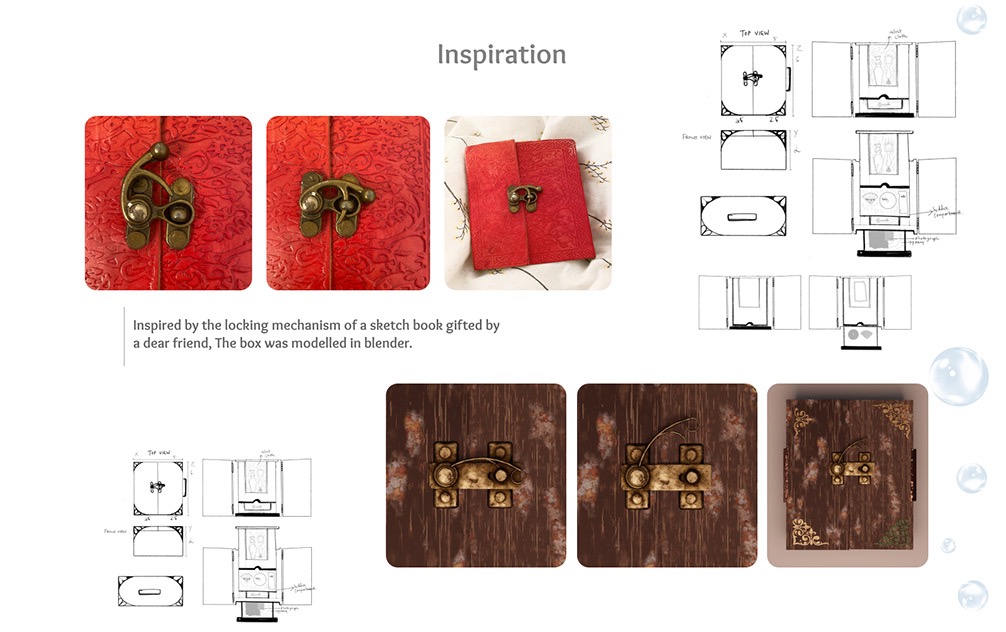
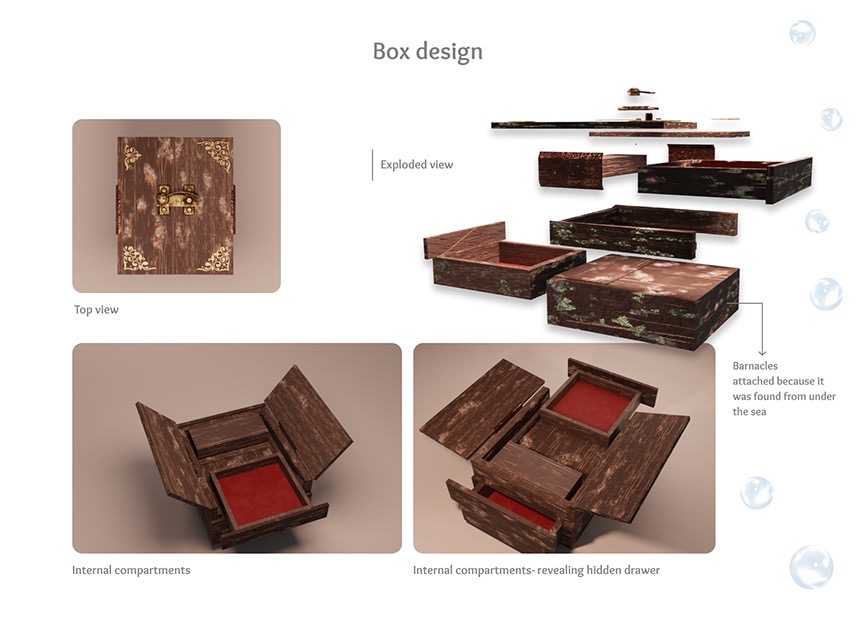
The mood board set the object language; a real, gifted keepsake set the mechanism. The box's clasp is modelled directly on the brass lock of a sketchbook given to me by a friend, carried through into the exhibit's own branding.
Object design
Every artefact, sketched and modelled
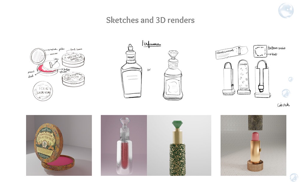
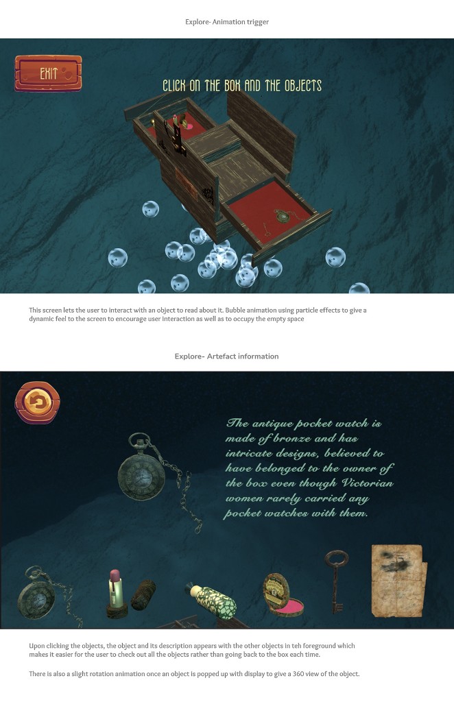
Each item inside the box, a rouge tin, a lipstick, a perfume bottle, was sketched first, then built as a 3D asset so it could be lit, rotated and dropped straight into the UI.
Information architecture
Mapping the flow before the visuals
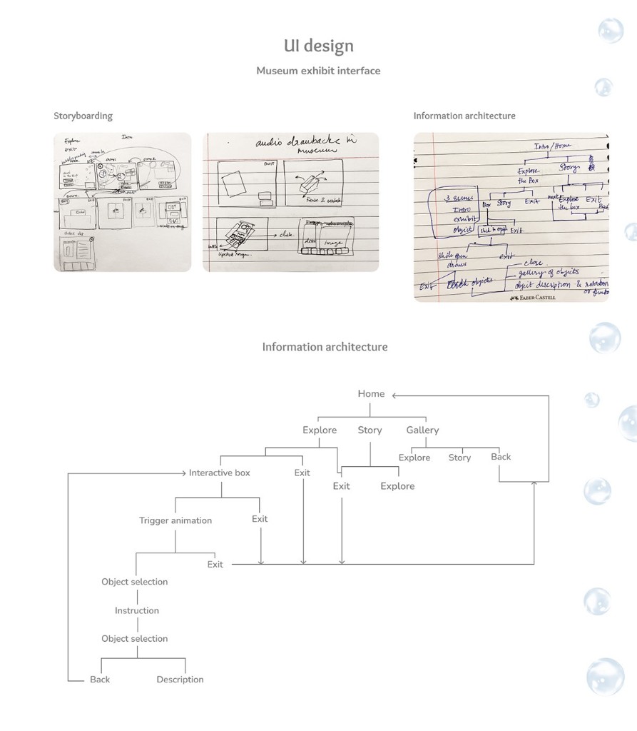
Paper storyboards and a flow diagram came first, working through how a visitor moves between the home screen, the story, and the box itself, including how the “explore” loop of triggering, selecting and reading an object should branch and return.
Visual design
An interface that feels found, not built
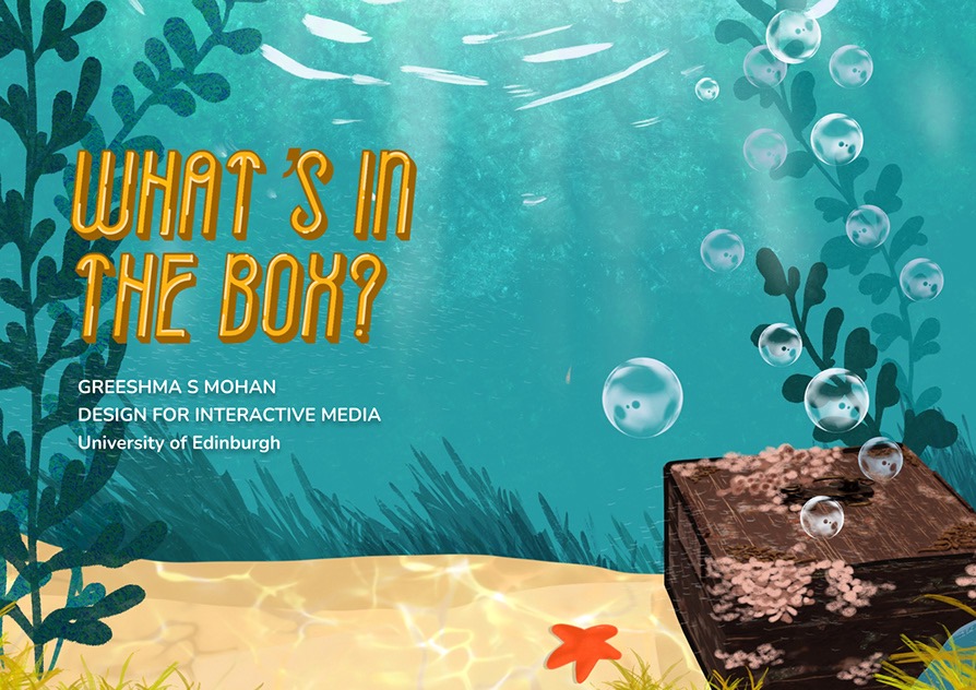
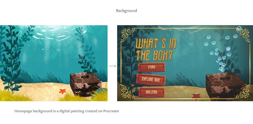
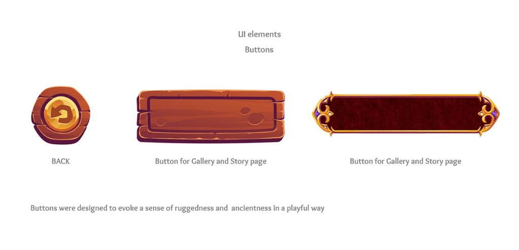
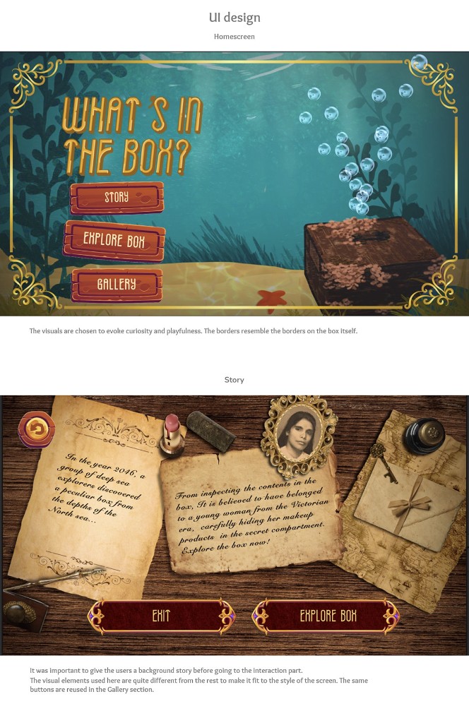
The homepage background is a digital painting made in Procreate; UI elements like the buttons were designed to read as rugged and aged, but still playful, carved wood for navigation, ornate metal framing for the story panels.
The experience
Home, story, explore
The finished flow gives visitors a reason to explore before they're asked to interact, a short backstory sets up the box, then the exhibit opens into an object-by-object discovery.
Design system
A palette pulled from the seabed and the box
Colour and type stayed consistent across every screen: teal seabed tones for exploration, warm wood and brass for navigation, aged parchment for narrative moments.
Reflection
What the project pulled together
4
Screens designed end to end: Home, Story, Explore and Gallery
6+
Original 3D-modelled artefacts, from sketch to render
1
Fictional object world built from a single two-word brief
Working across narrative, illustration, 3D modelling and interaction design end to end pushed me to treat the object itself, its material, its history, its mechanism, as the source of every UI decision, rather than styling a generic interface after the fact.